If I access service catalog, the offerings are displayed in a better way, like the print above:
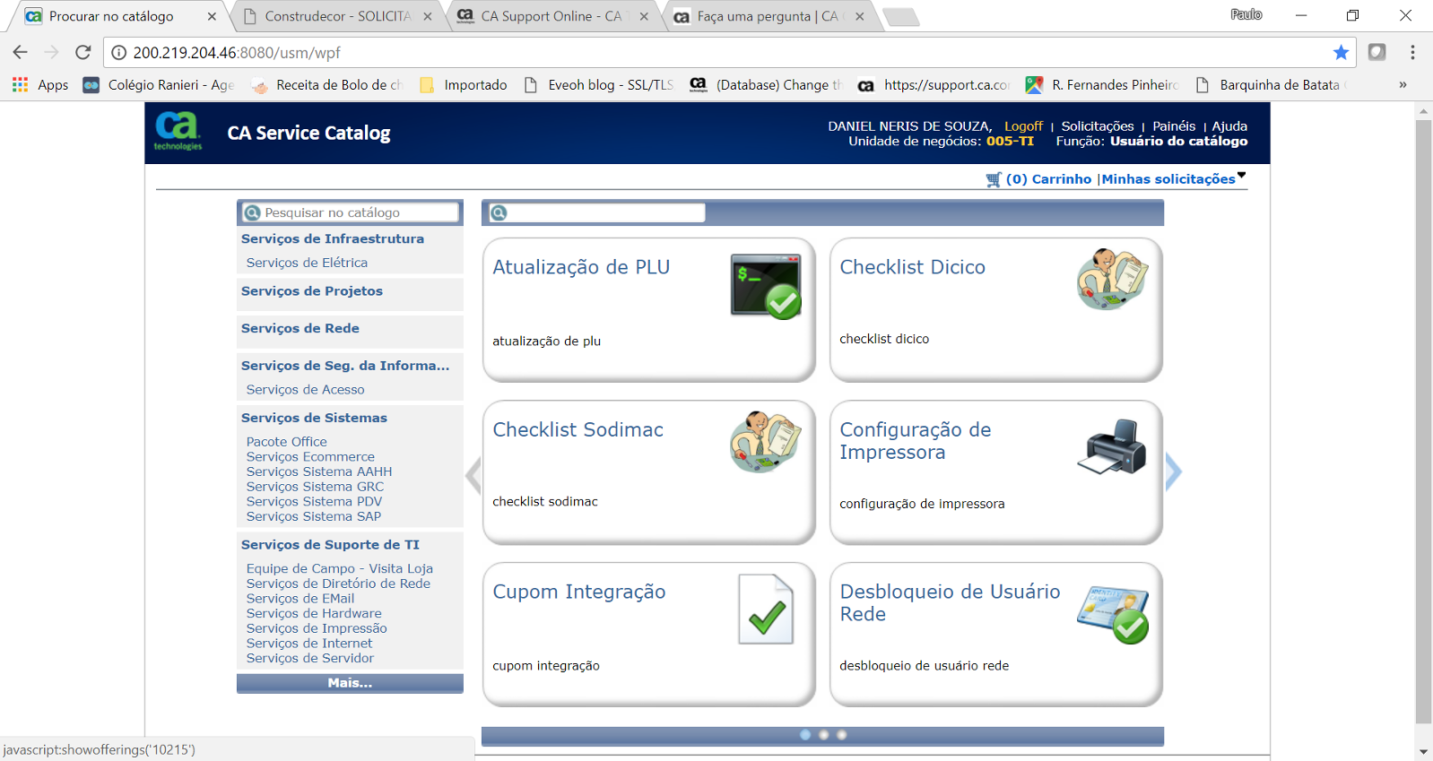
If an offering like "Desbloqueio de Usuario Rede", the last in the down right side has a big name, the system put automatically a line break and the full name can be viewed.
Otherwise, If I access the same set of offerings using USS, the viewing is very poor, as figure below:
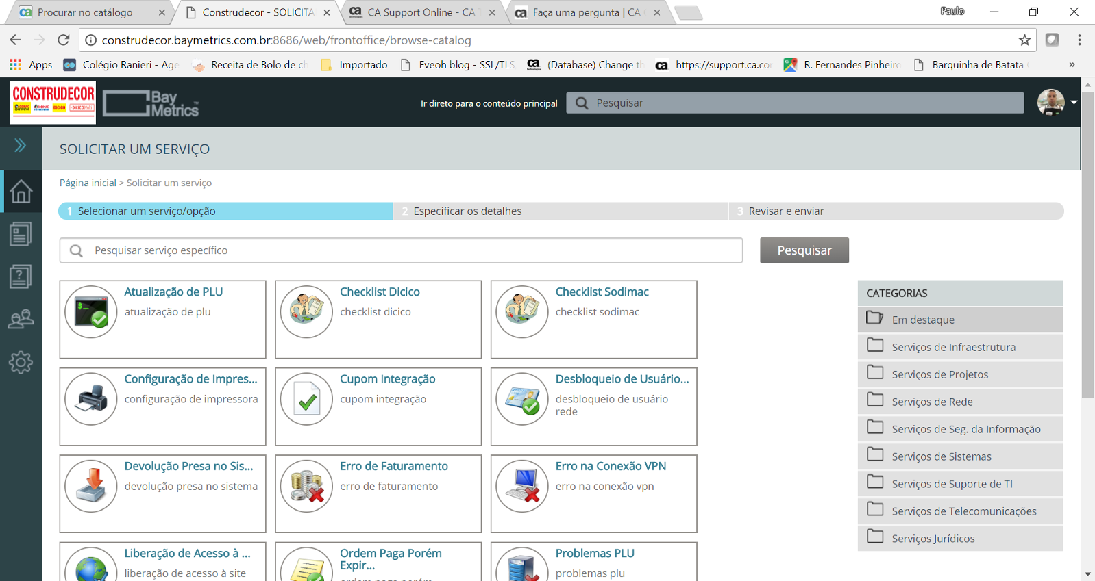
In this visualization the same offering described earlier, has its name broken "Desbloqueio de Usuário..."
It is possible to configure this visualization to allow line break or increase the size of the offering box?