Hi Catalog gurus,
It's been a while since a last comment.
A question on aesthetics.
When viewing a catalog request, it shows comments as a required field, which is great.
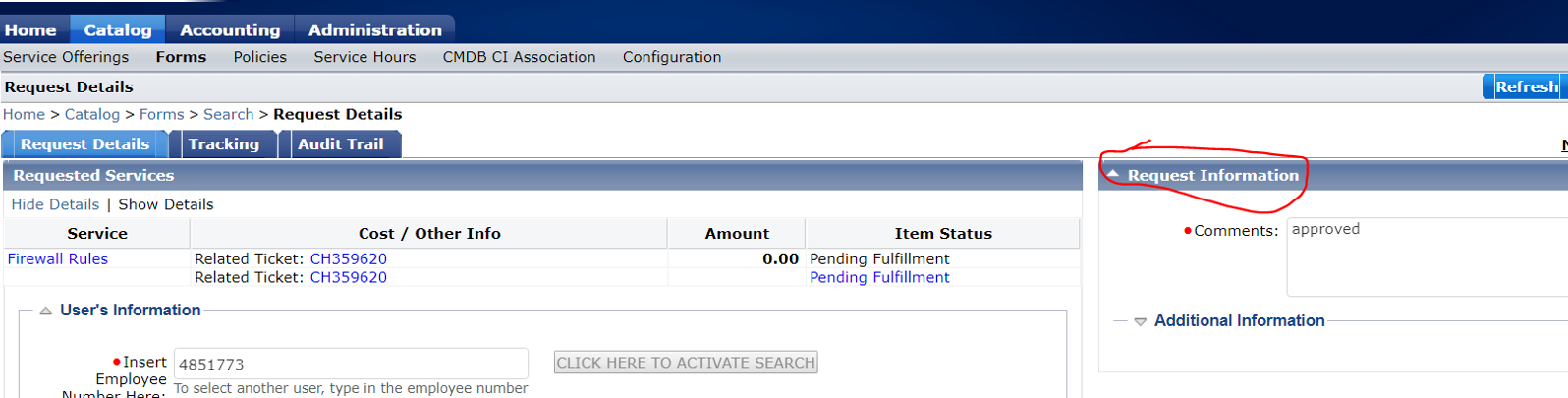
But it takes up half of the screen on the right hand side, making it very difficult to read important details, especially tables with lots of columns.
Only when approving does the request information appear at the bottom making the form now legible. There is inconsistency.
Can you please advise?